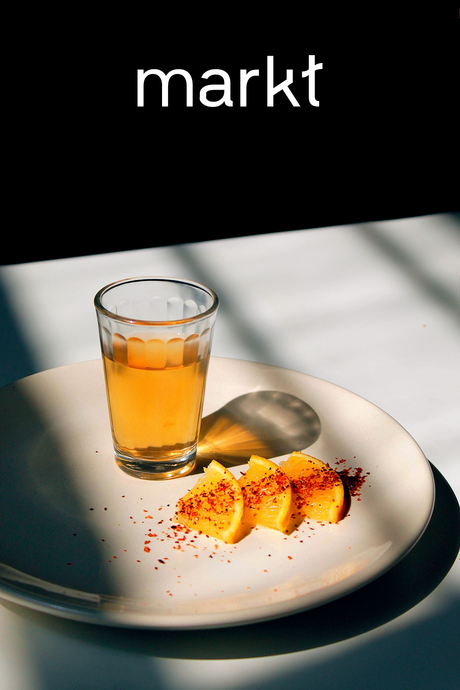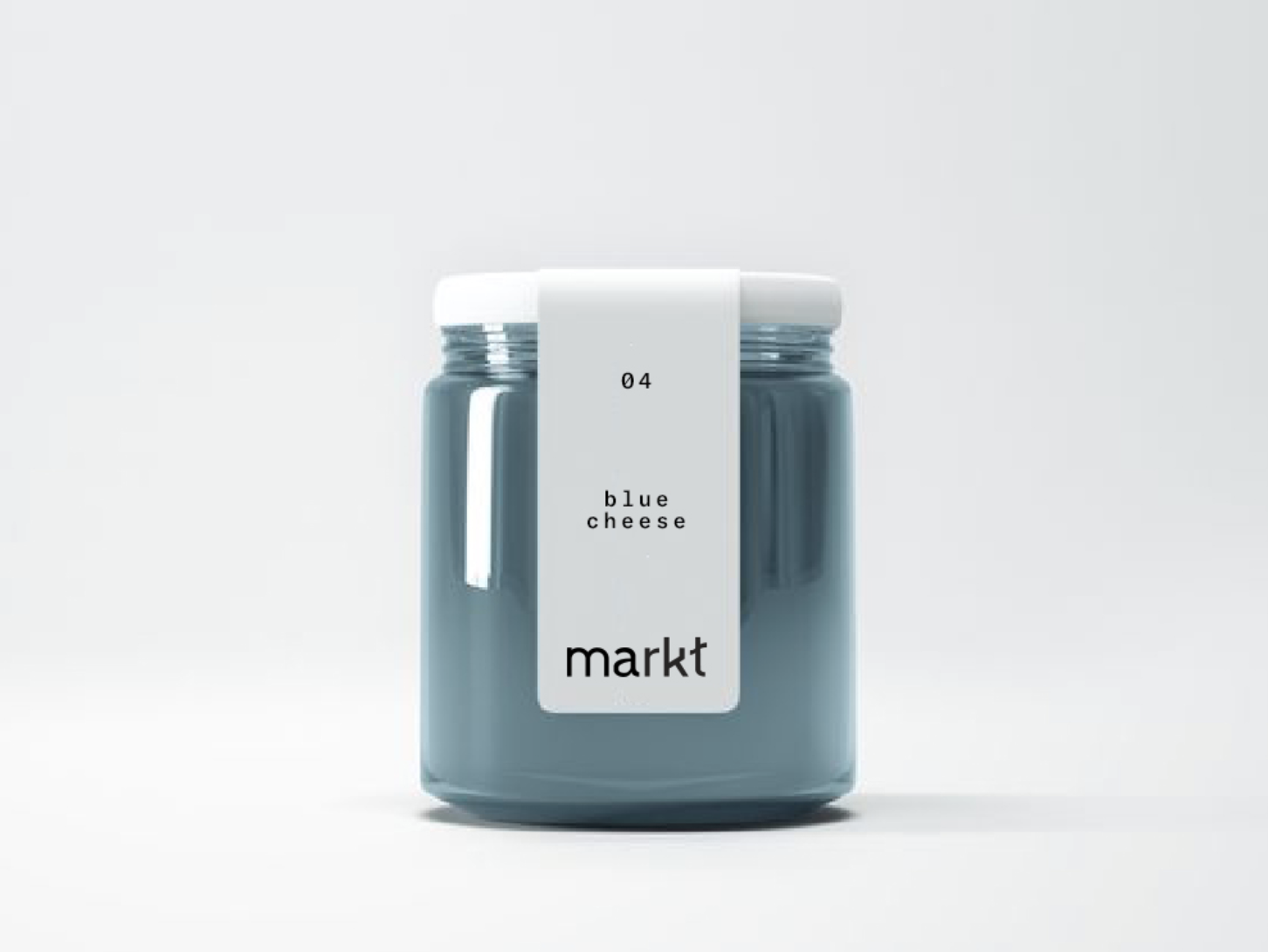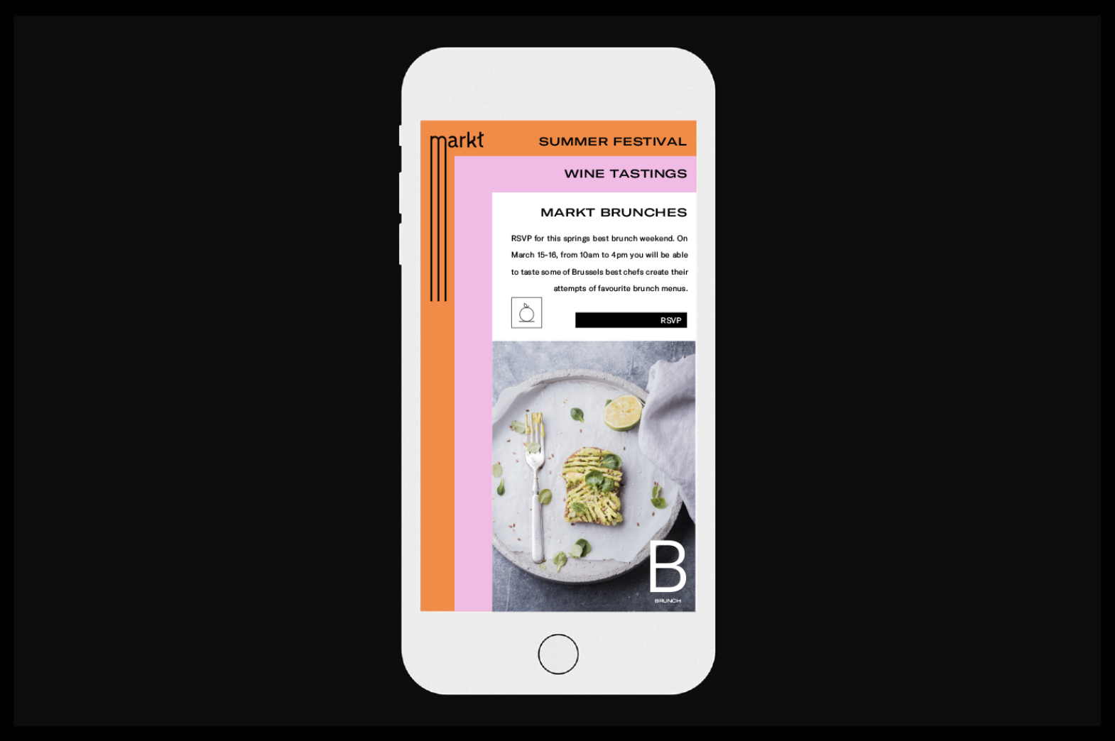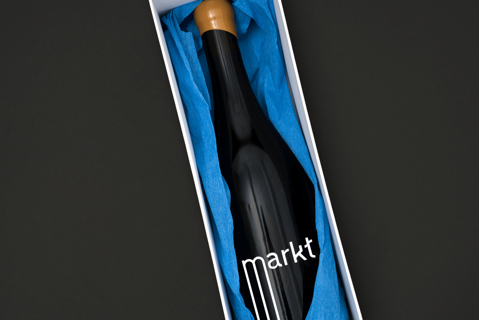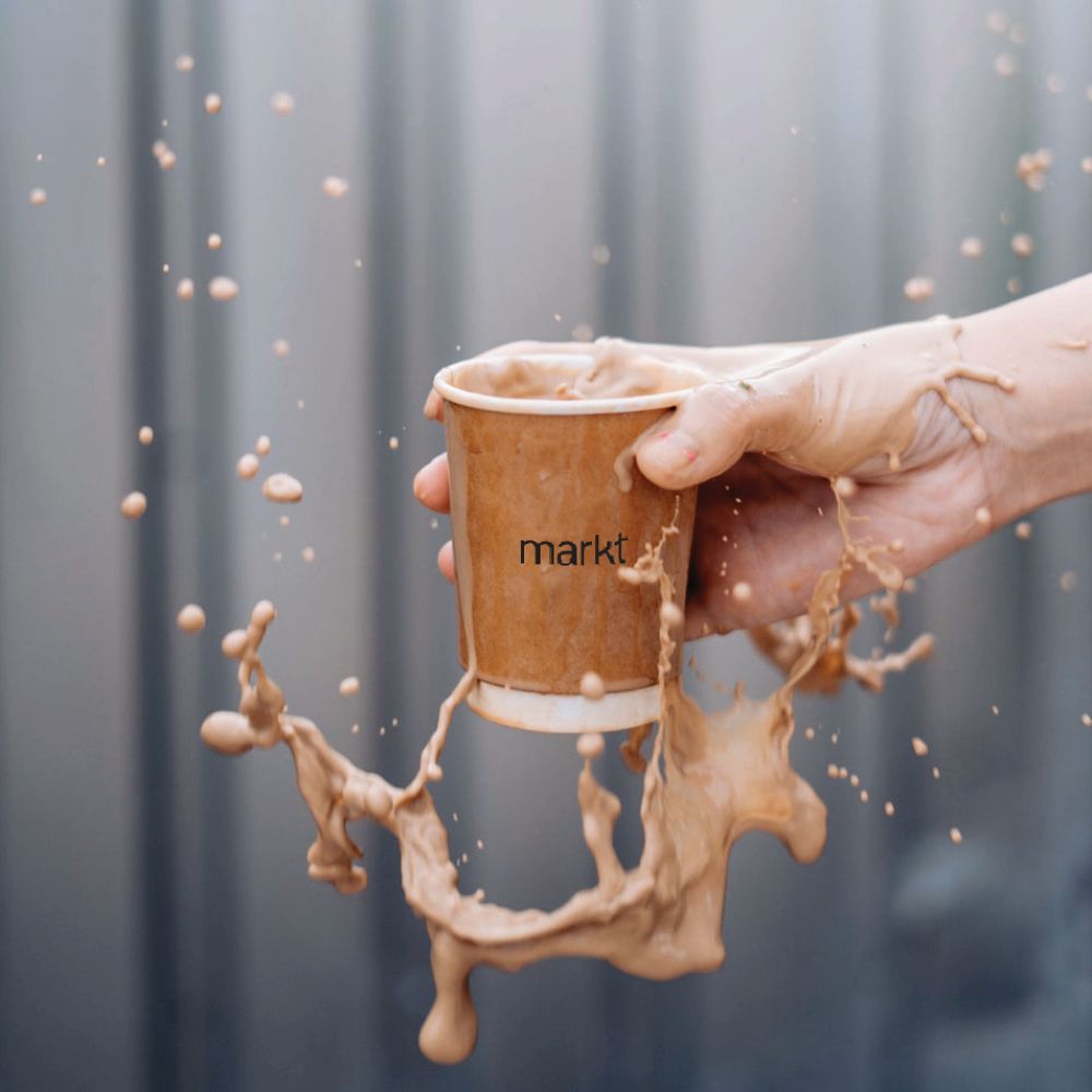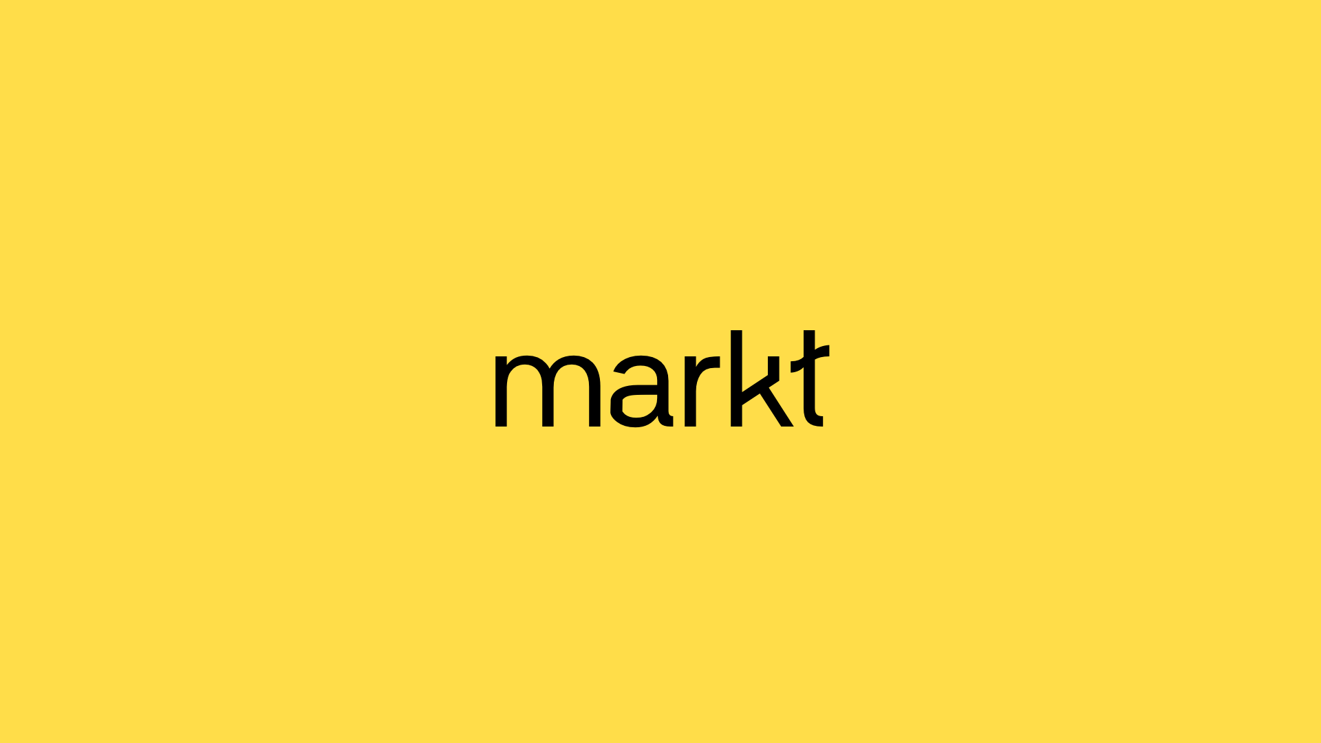
MARKT
was one of the most curious projects that came my way in 2018.
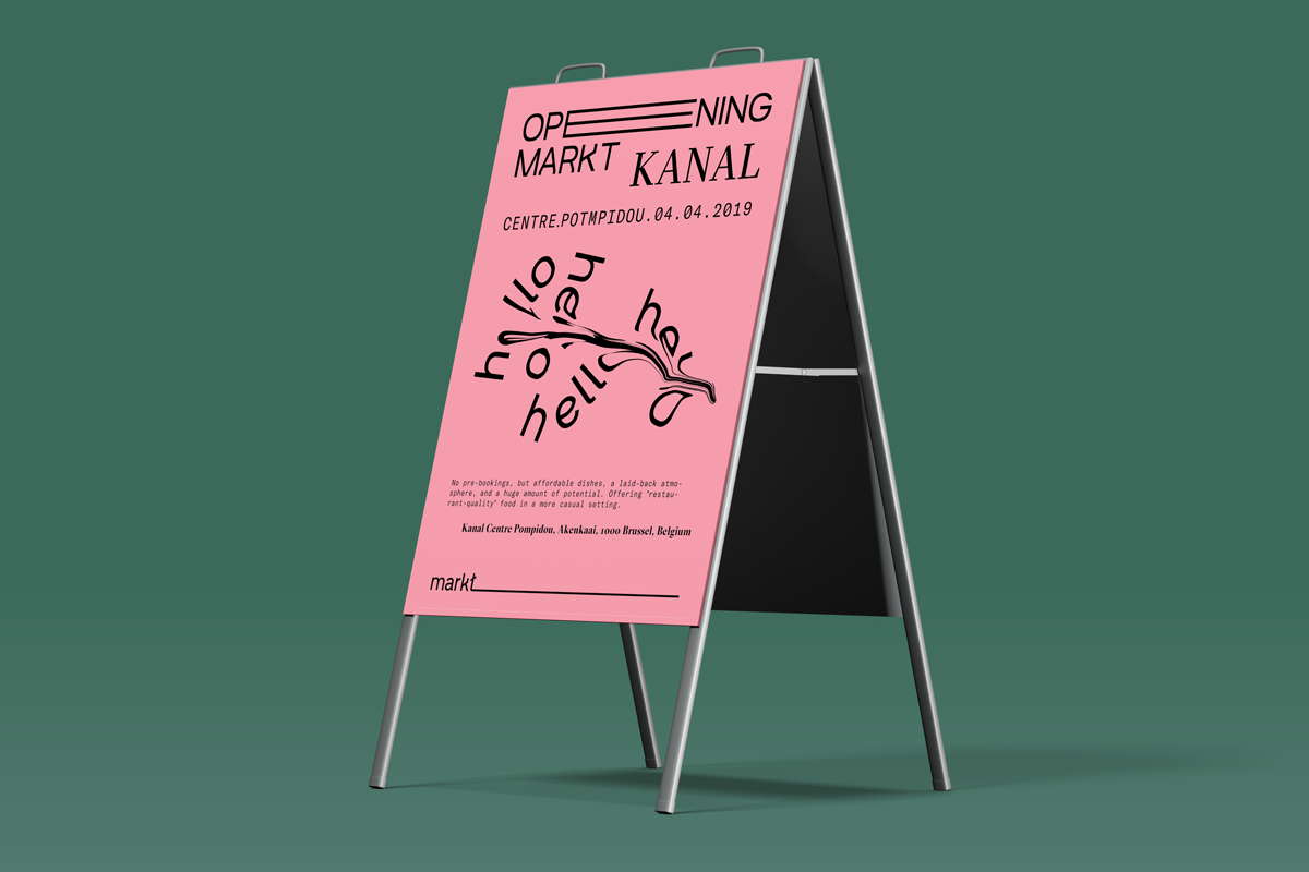
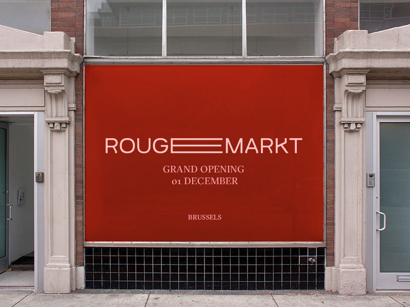
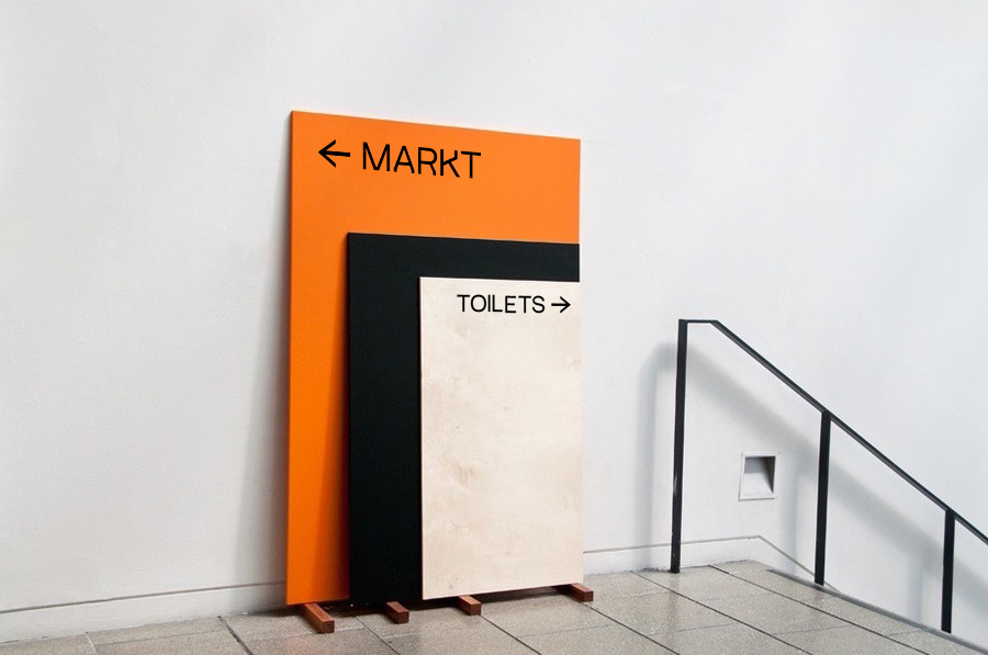
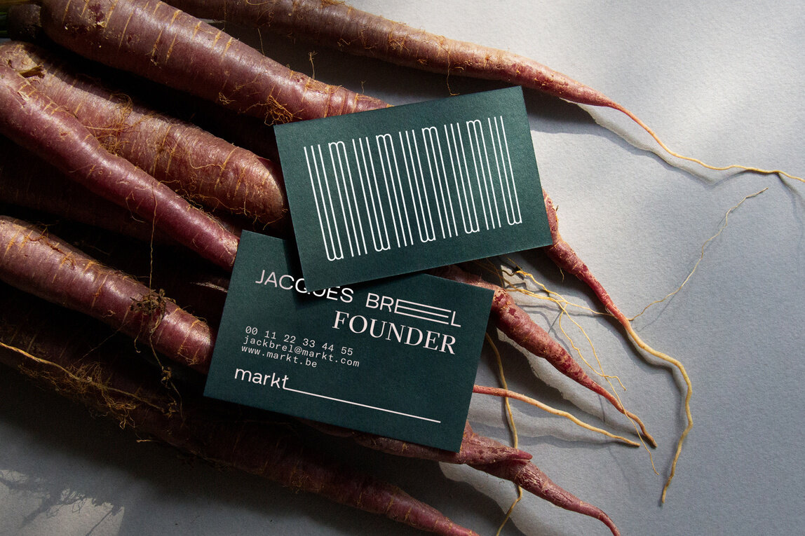
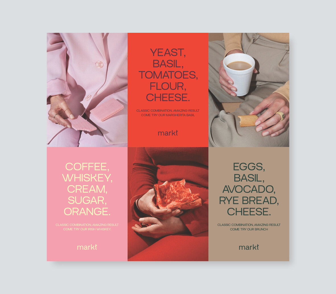
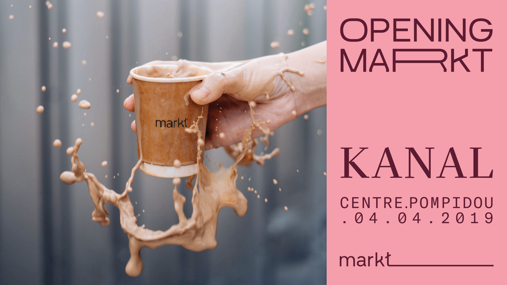
It started with sketching logos for this friend-led initiative that quickly became a cultural institution through catering for the public in Brussels. Their main incentive was to push the boundaries of street food, which they promptly achieved while becoming the go-to place for after-work parties, summer festivals and Christmas specials. Sylvain Azzi and I were delighted to create a complete identity for the guys to play with and expand.
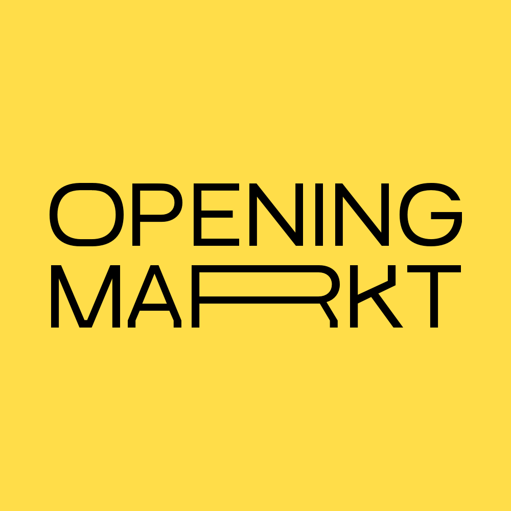
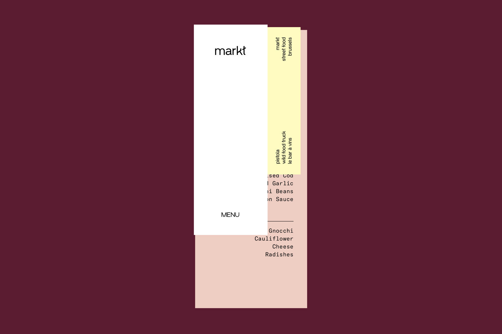
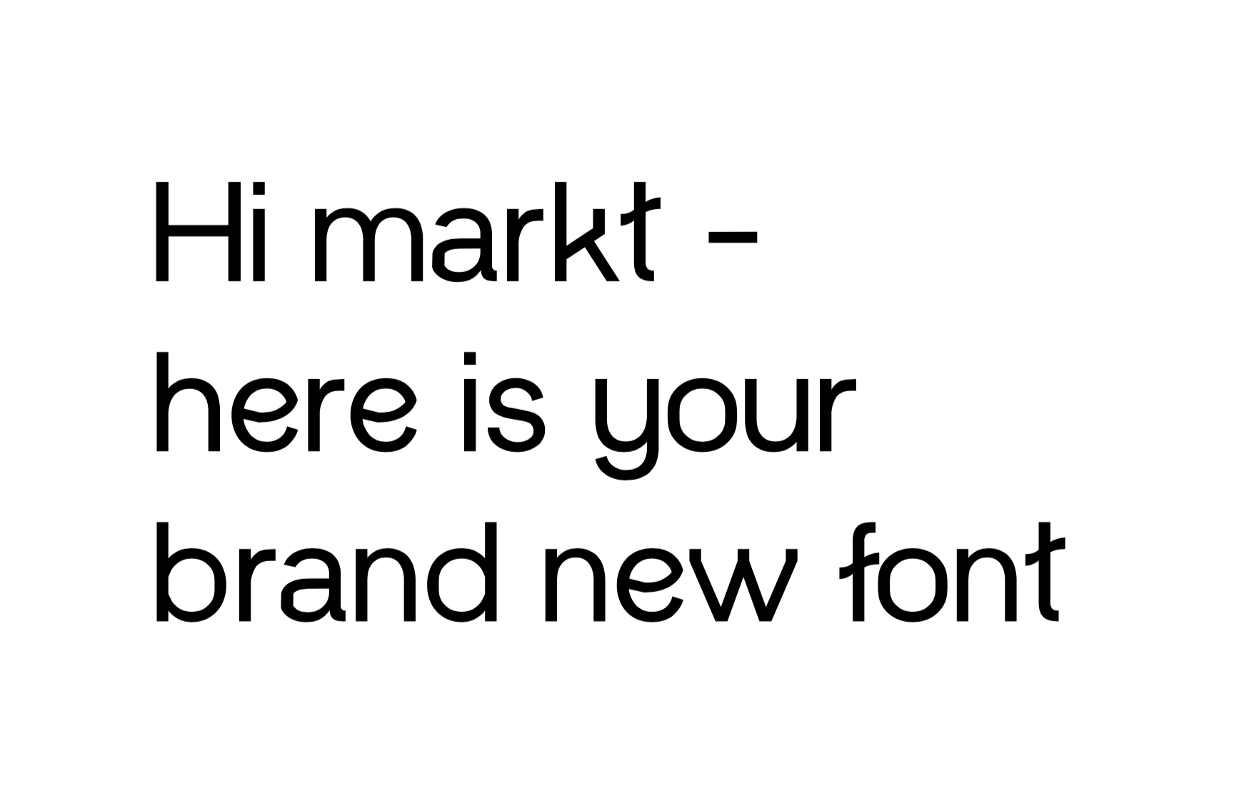
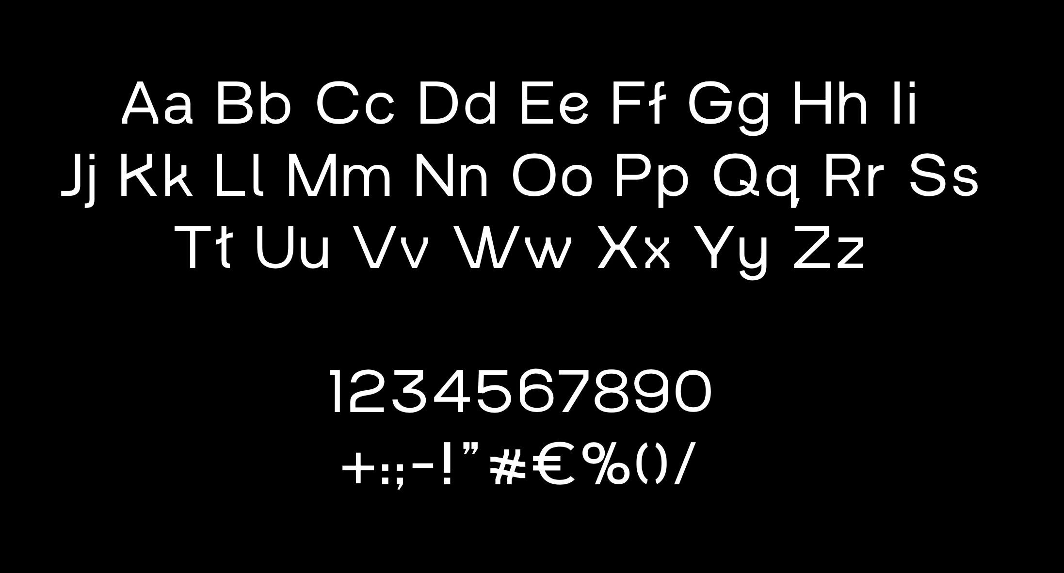
The MARKT font
After working on various logo iterations, we drifted toward creating a unique type for the group, concluding that the identity's core would be built on a recognisable font. Three months of setting, kerning and testing had passed, and we delivered our very first brand that included a hand-made type!

Other logo variations from the initial exploration phase.